Building a Responsive Filter Component on React

Written by

As users come to expect the same quality of UI from websites as in native applications, it’s a good idea to implement some native patterns that are common in native UIs. However, some patterns that work well for desktop applications don’t necessarily work for mobile, and vice versa.

This can pose a challenge when building responsive web applications that have to take into account multiple layouts and screen widths. Today, we’ll implement a filter component that adapts not only its layout but also its behavior according to the device’s screen size to provide a UI that feels comfortable on both mobile and desktop devices.

What we’re building

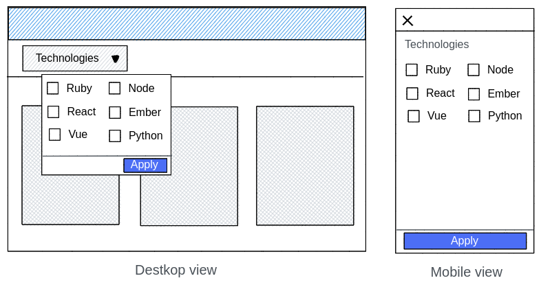
Let's start with a mockup of the component to implement. The idea is to provide users with a button that, when active, will display a dropdown on desktop and a fullscreen modal on mobile:

In order to achieve this, we’ll implement a single component that will, depending on the screen, display one component or the other.

Implementing the button

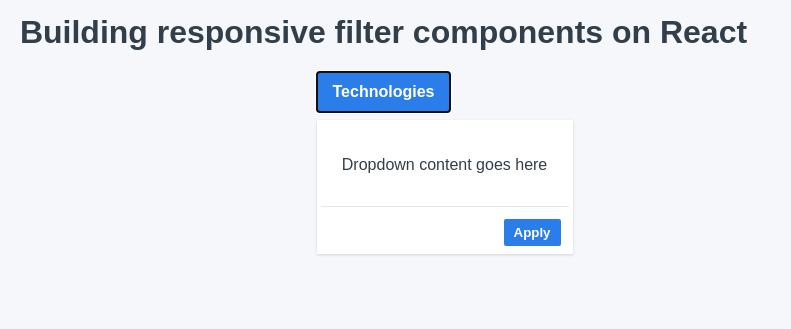
The first step will be implementing a button that will hold the state of whether the filter is open or not. We’ll also apply some basic styling so that our button looks good:

/* Filter.js *
import React, { useState } from "react";
import "./filter.css"

default function Filter() {
	const [isOpen, setIsOpen] = useState(false);  
    return (    
    	<div classname="filter"></div>  
        
        <button onclick="{()" ==""> setIsOpen(!isOpen)} className="filter__button
    </button      
    
    	Technologies    
   	);
}
.filter {
 position: relative;
 display: inline-block;
}

.filter__button {
 border-radius: 0.125rem;
 padding: 0.5rem 1rem;
 background-color: #2b7de9;
 background-image: none;
 cursor: pointer;
 border: transparent;
 font-weight: 600;
 color: white;
 font-size: 16px;
 line-height: 1.5;
}

.filter__button:hover {
 background-color: #176dde;
}
.filter__button:focus {
 outline: 1px dotted;
 outline: 1px auto -webkit-focus-ring-color;
}

Implementing the dropdown for desktop

Our button looks pretty good, but it doesn’t do much. Let’s fix that by showing a drop-down whenever the isOpen state is set to true and adding the button in charge of applying the filter:

<div classname="filter"></div>  

	<button onclick="{()" ==""> setIsOpen(!isOpen)} className="filter__button"></button>    
    Technologies    
    
{isOpen && (
	<div ref="{dropdownRef}" classname="filter__dropdown"></div>
    	<div style="{{" paddingtop:="" "2rem",="" paddingbottom:="" "2rem"="" }}=""></div>
        	{`Dropdown content goes here `}‍            
        
        <div classname="filter__dropdown__actions"></div>‍        
        <button onclick="{handleApply}" classname="filter__dropdown_button"></button>‍          
        
        Apply        ‍      ‍      
)}

We need to make sure that the dropdown stays hidden on smaller screens. There’s a couple of ways we could do this, but to keep it simple we’ll use a media query and hide the dropdown on smaller screens:

.filter__dropdown {
 box-shadow: 0 1px 3px 0 rgba(0, 0, 0, 0.1), 0 1px 2px 0 rgba(0, 0, 0, 0.06);
 padding: 0.25rem;
 display: none;
 width: 16rem;
 z-index: 50;
 left: 0;
 max-height: calc(100vh - 152px);
 position: absolute;
 margin-top: 0.5rem;
 background-color: white;
}
@media (min-width: 768px) {
 .filter__dropdown {
   display: block;
 }
}
.filter__dropdown__actions {
 border-top-width: 1px;
 border-top-color: #e4e7eb;
 border-top-style: solid;
 display: flex;
 align-items: center;
 justify-content: flex-end;
 padding: 0.75rem 0.5rem 0.25rem 0.5rem;
}

.filter__dropdown__actions button {
 border-radius: 0.125rem;
 padding: 0.25rem 0.5rem;
 background-color: #2b7de9;
 border-color: transparent;
 color: white;
 font-weight: 600;
 cursor: pointer;
}

There’s one last piece left in our dropdown implementation. Whenever a user clicks outside of the floating dropdown, they’d expect the modal to close. In order to implement that, we’ll have to enhance our component with a couple of Refs and the useEffect hook:

useEffect(() => {
   const handleClickOutside = event => {
     const isDropdownClick =
       dropdownRef.current && dropdownRef.current.contains(event.target);
     const isButtonClick =
       buttonRef.current && buttonRef.current.contains(event.target);

     if (isDropdownClick || isButtonClick) {
       // If the ref is not defined or the user clicked on the menu, we don’t do anything.
       return;
     }
     // Otherwise we close the menu.
     setIsOpen(false);
   };

   document.addEventListener("mousedown", handleClickOutside); // handle desktops
   document.addEventListener("touchstart", handleClickOutside); // handle touch devices

   // Event cleanup
   return () => {
     document.removeEventListener("mousedown", handleClickOutside); // handle desktops
     document.removeEventListener("touchstart", handleClickOutside); // handle touch devices
   };
 }, [dropdownRef, buttonRef]);

This will prevent the dropdown from unexpectedly closing while the user is interacting with the filter.

Protip: You could further refactor this useEffect call into a custom useClickOutside hook to avoid cluttering your component.

Let’s have a look at how our component is going so far:

So far so good! Now let’s continue with the implementation for mobile devices.

Implementing the modal for mobile

Modals seem like a very simple concept on paper: just cover the whole screen with a view on top of everything else. However, they can be quite tricky to get right especially if you want to provide an accessible modal. Therefore we’ll be leveraging Reach UI to help us manage focus states, semantic elements and other complexities associated with modal components.

Let’s start by creating our own <filtermodal ></filtermodal > component, which we can later bring into the <filter></filter> component:

/* FilterModal.js */

import React from "react";
import { DialogContent, DialogOverlay } from "@reach/dialog";
import "./filterModal.css";

const FilterModal = React.forwardRef(  
	
    ({ children, onApply, onDismiss }, ref) => {
    	return (      
        	<dialogoverlay classname="filter-modal"></dialogoverlay>
            
            ref={ref}
            className="filter-modal__wrapper"          
            aria-label="modal window"        
            >          
            
            <div classname="filter-modal__header"></div>            
            <button onclick="{onDismiss}">x</button>
            
            <div classname="filter-modal__content">{children}</div>                    
            <div classname="filter-modal__actions"></div>            
            <button onclick="{onApply}">Apply</button>
            
            );  
		}
);

export default FilterModal;

And its corresponding css:

# filterModal.css

.filter-modal {
 display: block;
 background-color: transparent;
}
@media (min-width: 768px) {
 .filter-modal {
   display: none;
 }
}

.filter-modal__wrapper {
 z-index: 50;
 position: fixed;
 top: 0;
 left: 0;
 background-color: white;
 right: 0;
 bottom: 0;
 display: flex;
 flex-direction: column;
}

.filter-modal__header {
 display: flex;
 padding: 1rem 0.5rem;
 border-bottom-width: 1px;
 border-bottom-color: #e4e7eb;
 border-bottom-style: solid;
 justify-content: flex-end;
}

.filter-modal__content {
 display: flex;
 flex-direction: column;
}

.filter-modal__actions {
 border-top-width: 1px;
 border-top-color: #e4e7eb;
 border-top-style: solid;
 display: flex;
 align-items: center;
 justify-content: flex-end;
 padding: 0.5rem;
 margin-top: auto;
}

.filter-modal__actions button {
 border-radius: 0.125rem;
 padding: 0.25rem 0.5rem;
 background-color: #2b7de9;
 border-color: transparent;
 color: white;
 font-weight: 600;
 cursor: pointer;
 width: 100%;
}

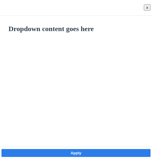
Now we have a modal component that will only appear on small screens:

Great, we’re ready to pull this modal into our Filter component. Notice that the modal accepts a Ref. Just like with the dropdown, we’ll need to use this to prevent the modal from closing unexpectedly when the user interacts with it. We’ll also need to provide some props to handle the dismiss and apply actions:

import React, {	useState, useRef, useEffect} from "react";

import "./filter.css";‍

import FilterModal from "./FilterModal";

export default function Filter() {  
	const[isOpen, setIsOpen] = useState(false);  
    const dropdownRef = useRef(undefined);  
    const buttonRef = useRef(undefined);  
    const modalRef = useRef(undefined);

useEffect(() = >{  
	const handleClickOutside = event = >{  
    const isDropdownClick = dropdownRef.current && dropdownRef.current.contains(event.target);  
    const isButtonClick = buttonRef.current && buttonRef.current.contains(event.target);  
    const isModalClick =  modalRef.current && modalRef.current.contains(event.target);  

if (isDropdownClick || isButtonClick || isModalClick) {    
	/* If the ref is not defined or the user clicked on the menu, we don’t do anything. */
	return;  
}  

/* Otherwise we close the menu. */
    setIsOpen(false);  
};  

document.addEventListener("mousedown", handleClickOutside);	/* handle desktops */
document.addEventListener("touchstart", handleClickOutside); /* handle touch devices */
			  
/* Event cleanup */
return () = >{    
	document.removeEventListener("mousedown", handleClickOutside); /* handle desktops */
	document.removeEventListener("touchstart", handleClickOutside); /* handle touch devices */	  
	};
}, [dropdownRef, buttonRef, modalRef]);‍

const handleApply = () = >{‍  
	alert("Filters applied!");‍  
    setIsOpen(false);‍
};

return (   
	< div classname = "filter" > </div>          
    
    ref={buttonRef}      
    onClick={() => setIsOpen(!isOpen)}      
    className="filter__button"    
    >‍      
    
    Technologies    ‍    
    
    {isOpen && (      
    	<div ref="{dropdownRef}" classname="filter__dropdown"></div > ‍    
    		<div style="{{" paddingtop:="" "2rem",="" paddingbottom:="" "2rem"="" }}=""></div>        

			{`Dropdown content goes here `}‍        ‍      

		<div classname="filter__dropdown__actions"></div > ‍         
			< button onclick = "{handleApply}"classname = "filter__dropdown_button" > </button>‍          
            	Apply        ‍      ‍        
     )}    
     {isOpen && (‍              
     
     	ref={modalRef}        
        onApply={handleApply}        
        onDismiss={() => setIsOpen(false)}      
        >‍        
        	
            {`Modal content goes here `}‍          
        )}‍   
    );
}

And with that, we’ve implemented all the behavior we need for our responsive filter to handle small and large screens. But before we move on to implement features with our new component, let’s clean it up a little and make it more general purpose.

Making it reusable

One of the best things about React is that we can extract UI blocks into reusable components. Let’s enable our Filter component to receive arbitrary content from any screen.  We’ll use React’s composition model to allow our Filter to accept a children prop. This will let the parent element control what kind of content goes inside our filter component.

Let's take a look at our completed Filter component:

import React, { useState, useRef, useEffect } from "react";‍

import "./filter.css";‍

import FilterModal from "./FilterModal";

export default function Filter({ children, onApply, label }) {  
	const [isOpen, setIsOpen] = useState(false);  
    const dropdownRef = useRef(undefined);  
    const buttonRef = useRef(undefined);  
    const modalRef = useRef(undefined);
    
useEffect(() => {  
	const handleClickOutside = event => {    
    	const isDropdownClick =      
        	dropdownRef.current && dropdownRef.current.contains(event.target);    
        const isButtonClick =      
        	buttonRef.current && buttonRef.current.contains(event.target);    
        const isModalClick =      
        	modalRef.current && modalRef.current.contains(event.target);    
            
	if (isDropdownClick || isButtonClick || isModalClick) {      
    	/* If the ref is not defined or the user clicked on the menu, we don’t do anything. */       
        return;    
    }    
    
    /* Otherwise we close the menu. */ ‍    
    
    setIsOpen(false);    
    };  
    
document.addEventListener("mousedown", handleClickOutside); /* handle desktops */  
document.addEventListener("touchstart", handleClickOutside); /* handle touch devices */  

/* Event cleanup */   
return () => {    
	document.removeEventListener("mousedown", handleClickOutside); /* handle desktops */    
    document.removeEventListener("touchstart", handleClickOutside); /* handle touch devices */   
    };
}, [dropdownRef, buttonRef, modalRef]);

const handleApply = event => {‍  
	setIsOpen(false);‍  
    onApply(event);‍
};

return (  
	<div classname="filter"></div>‍          
    
    	ref={buttonRef}      
        onClick={() => setIsOpen(!isOpen)}      
        className="filter__button"    
        >‍      
        
        	{label}‍        
            
        {isOpen && (‍      
        	<div ref="{dropdownRef}" classname="filter__dropdown"></div>‍        
            	<div style="{{" paddingtop:="" "2rem",="" paddingbottom:="" "2rem"="" }}=""></div>‍          
                	{children}‍              
                    
         <div classname="filter__dropdown__actions"></div>‍        
         	<button onclick="{handleApply}" classname="filter__dropdown_button"></button>‍          
            	Apply        ‍      ‍        
                
         )}‍    
         
         {isOpen && (‍              
         
         	ref={modalRef}        
            onApply={handleApply}        
            onDismiss={() => setIsOpen(false)}      
            >‍      
            
            {children}‍      
        )}‍  
    );
}

Putting it all together

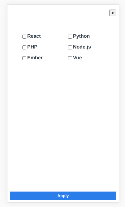
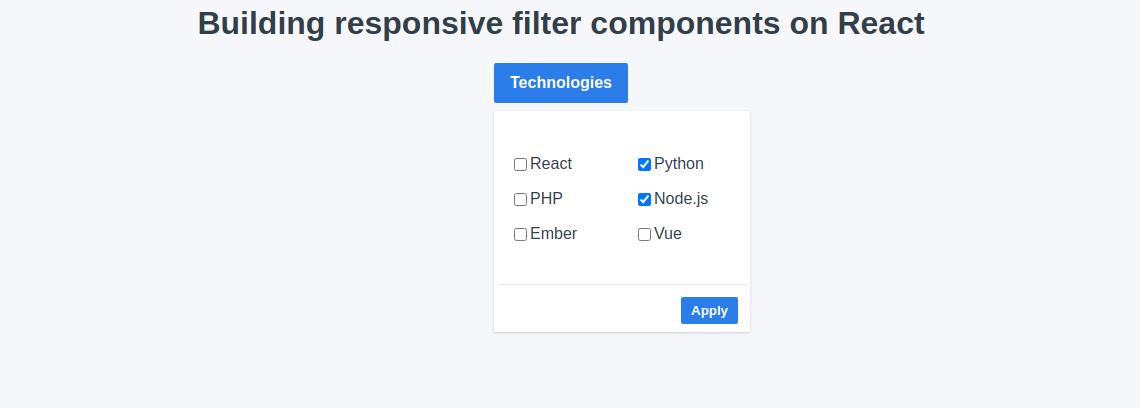
Now let's implement an actual user input to see how this all fits together. We’ll implement a multiple select filter where a user can select different technologies: 

import React, { useState } from "react";‍

import "./styles.css";‍

import Filter from "./Filter";

const technologies = ["React", "Python", "PHP", "Node.js", "Ember", "Vue"];

export default function App() {‍  
	const [selectedTechnologies, setSelectedTechnologies] = useState([]);  
    
    const handleSelect = technology => {    
    	const isSelected = selectedTechnologies.includes(technology);    
        /* If the option has already been selected, we remove it from the array. */‍    
        
        /* Otherwise, we add it. */ ‍    
        
    	const newSelection = isSelected    
        ? selectedTechnologies.filter(currentTech => currentTech !== technology)    
        : [...selectedTechnologies, technology];  
        
    setSelectedTechnologies(newSelection);
};

return (‍  
	<div classname="App"></div>‍    
    	<h1>Building responsive filter components on React</h1>‍    
        	<filter label="Technologies" onapply="{()" ==""> alert(selectedTechnologies)}></filter>‍      
            	<div classname="technologies-list"></div>‍        
                
                	{technologies.map((tech, index) => {          
                    	const isSelected = selectedTechnologies.includes(tech);          
                        return (            
                        	<label key="{index}"></label>‍                              
                            	type="checkbox"                
                                checked={isSelected}                
                                onChange={() => {‍                 
                                	
                                    handleSelect(tech);                
                                }}              
                            />‍              
                            
                            <span classname="ml-2 text-base text-gray-500 font-heading"></span>‍              
                            {tech}‍              ‍                      
                        );        
                    })}‍      ‍    ‍    
                    
        );
}

We can see how our Filter component displays a modal with the checkboxes on a mobile screen:

And how it displays a dropdown on desktop:

Closing thoughts

As a Senior Software Engineer working with other talented UI designers at FullStack Labs, a React consultancy with experience in creating complex user interfaces, I hope this article gave you a clear example of how to use composition in React to build reusable components.