How to deliver Pixel-Perfect interfaces using React Native
Written by
Johan Peña
Last updated on:
October 1, 2025
Written by
Last updated on:
October 1, 2025
The intention of this post is to give some tips on how to use the styling system of React Native (hereinafter referred to as RN) and the design tools commonly used when creating or developing a mobile application in order to generate pixel-perfect and optimal user interfaces.
Let's start from the beginning. When we start any project, the first thing we see before the code is the design given by a designer (insert more redundancies here) for the app to be developed. This is our first point of contact and, in my opinion, the most important one to deliver an application identical to the design. The first step is to validate with the designers and the client if these designs have already been approved and are ready to be delivered, as sometimes some of these components or even screens tend to change at their discretion. Once validated and approved, it's time to get to work. However, if these designs have not been approved yet, we can still work in the same way as described below.
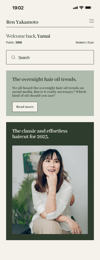
Design Example
For this blog, we will use the following design to help imagine a real case:
Componentize
I love starting with componentization. As is natural in RN, the first thing we should do is componentize the most atomic elements of the application in order to reuse them later on other screens (basically, that's why React was created). But where should we start? My recommendation is always the same: styles. Creating a file that contains all the styles of the application makes the job easier, as these are the most reused elements throughout the application's source code. For this purpose, this file should be divided into sections (to facilitate readability) that we will use throughout the development of the application to add new reusable styles to it.
Additionally, I recommend using the library react-native-size-mattersto generate styles that automatically scale on different types and sizes of screens.
Here's an example of how styles could be organized:
Note: It is also helpful to add the RN Dimensions API to be able to play with the native width and height of every device.
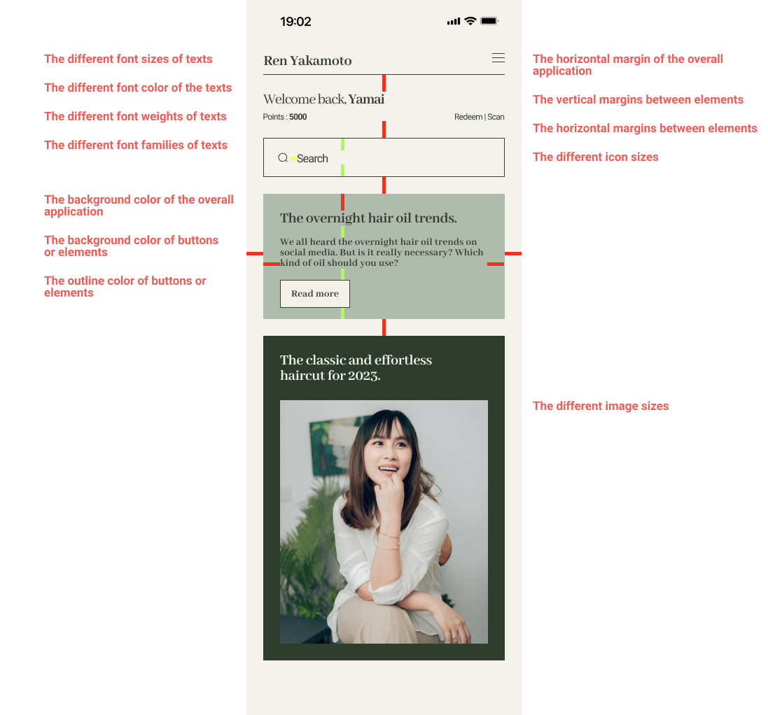
Once this layout is created to organize our designs, we move on to the next important step of componentization, which consists of identifying the elements in the design that are repeated most frequently, such as margins on the sides, title, subtitle, and text sizes, buttons or containers, colors, etc. Basically, finding the design patterns used in the UI and that we have separated into sections in our code.
To do this, we rely on two things: first, the design tool (Figma, Zeplin, Illustrator, etc.) where we can consult the specific size, color, and properties of each component. And second, the simulator or physical device on which we are recreating the interface. In this case, we should use a simulator or device that closely matches the size of the containers in the original designs.
For example, Figma uses presets of commonly used devices such as different versions of the iPhone, so it's easy to recognize which device we should use to develop the application. If the original design is made for iPhone 11, then we should develop the app on an iPhone 11 or at least on the iPhone 11 emulator.
Example of Common Design Patterns:
Note: Every single thing that is repeated more than once, is a component candidate.
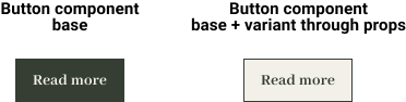
Once we have componentized our first set of styles, it's time to move on to the componentization of larger elements. Here, the goal is to identify those composite components that are repeated on different screens, such as buttons (usually composed of a View and a Text), search bars, or text inputs (composed of Views, Texts, and sometimes Images representing icons), etc. The idea in this case is to start using the previously defined styles to create new components based on them, and additionally, to continue expanding these styles with new elements that may have been missing before. These components should be as open as possible because they are often used to create variations of the same component. In this case, we take the style that is repeated the most in the designs as a base for designing these components, and then we add options through props that allow us to add new individual styles to each changing part within the same component.
Note: At the moment of creating the components, we can create a general screen where we can call them to render and see them in real-time, allowing us to compare them with the original designs. A good idea is to place the design next to the simulator (both with the same size) to compare each element individually as it is being created.
By implementing this strategy, we are sacrificing a bit more time and effort at the beginning of the project, but we ensure that the subsequent development of the screens is reduced by approximately 50%. All we need to do is call each component in its respective place, add props to customize it, and connect it with the state.
Image optimization
It is important to ensure that visual resources (images) also look good to achieve pixel-perfect designs. For this, we are going to use (or request) files of the best possible quality.
Visual resources are mainly divided into two categories: icons and static images. For icons and static images, it is important to use square resources, meaning the width should correspond to the height. This makes it easier to handle them in the layout and code.
For icons, I recommend using PNG files with a minimum width and height of 24 pixels. Additionally, these icons should be in black or white color to assist React Native's tint color change. In these cases, SVG files can also be used, following the same recommendations. However, using an external library for SVG files is often not entirely necessary.
For static images (such as placeholders for no results, accompanying visual resources, decorative elements, etc.), I recommend using images in their original design aspect ratio, as well as in PNG format.
In both cases, it is important to export the visual resources in three variations: the base image, an image with double the resolution (x2), and an image with triple the resolution (x3).
Screen Creation
As mentioned earlier, creating the general components of the application will reduce the time it takes to generate the screens for the rest of the application. We only need to focus on calling them and passing the corresponding props to customize them. In this step, we may encounter new components that were not initially evident or unique components for each screen, but these are isolated cases. We can still complete these screens using the general components and in many cases, we expand the list of components so we can use them in other screens.
When integrating the components into our screens, we must make use of the props that modify our atomic components to properly position them on the screen. Once this is done, the only remaining step is to connect the logical part and state management of the application with our atomic components. We should be careful not to fall into the problem of excessive re-rendering, but that is another topic unrelated to interface creation.
For this purpose, I always recommend adding a prop in the parent component of the JSX component called addStyles. This prop allows us to modify the complete layout of the component. Additionally, we can add other props for each item within the component that may receive changes in the future. For example, if we want to modify the color of the text in a button, we should add an attribute called addTextStyles to handle those changes.
Screen Layout
When arranging components on our screen, we will encounter some interesting scenarios where we need to consider the configuration of our components to make them more versatile. Here are some of those scenarios and how to address them.
Whole or partial width components
It is common for components in the designs we receive to either have a defined width in some screens but a full width in others. In these cases, it is better to create components that by default always occupy the full width of the screen. We can customize this attribute from the parent component by using an additional style prop. To achieve this, we need to ensure that the component has the following property:
flex: 1
This property allows our component to occupy the full available width within its parent container. Then, through a prop, we can add an extra style from its parent component to give it a customized width.
Double Components Inline
Sometimes we need to align two components side by side within the same horizontal space. Referring to the previous point, we have already solved this issue by using the property flex: 1, when we place two components in the same container, they will both occupy exactly half of the available space.
Components with different variants
Sometimes we encounter components that are essentially the same but differ in simple aspects such as size, color, or style. In such cases, we should refer back to the section on componentization and always include additional props that can be passed from the parent component, allowing us to add custom changes when needed.
Last recommendations
“The devil is in the details.” If you are unsure whether a component resembles the original design or not, it's worth comparing the design side by side with the device simulator.
Always use the colors provided in the design application, rather than guessing. All platforms offer tools to review these attributes, along with other important ones like width, height, size, and transparency. If for some reason you don't have access to these properties, I recommend creating a Figma playground where you can copy and paste elements to modify or review them in detail. For example, you can copy a section of what you want to review, paste it onto an empty Figma page, and use the eyedropper tool to check the original color.
Try to avoid using transparency. It's a simple thing, but it can help optimize the rendering of elements on the screen.
Make use of available tools. For example, Figma offers the option to visualize designs directly on your physical device in real size, allowing for a more detailed view of the screens to be created.
Take some time before creating the layouts to consider the arrangement and order of the elements. I always recommend reviewing the design and imagining the layers that make up a component or screen. This helps keep the code cleaner and simpler.
In conclusion, following the practices outlined above offer several advantages. First and foremost, componentization allows for the reuse of atomic elements, reducing development time and effort in creating repetitive UI elements. By organizing styles in a central file, developers can easily manage and add new reusable styles throughout the application. Additionally, using a design tool and simulator or device closely matching the original designs ensures accurate implementation and consistency. The componentization of larger elements further enhances reusability and flexibility, as composite components can be easily created and customized using the defined styles. This approach significantly reduces the time required to develop screens and allows for variations of the same component with different styles and props.
Therefore, by adhering to these practices, developers can streamline their workflow, reduce development time, maintain consistency, and ultimately, deliver pixel-perfect UIs efficiently using React Native.
How can I make sure my React Native app matches the original design?
The most effective way to ensure pixel-perfect accuracy is to work closely with the design team before starting development. Always confirm that the designs are finalized and approved to avoid unnecessary rework. Once that’s done, break the interface into smaller, reusable components. Use the exact sizes, spacing, and colors provided in the design tool — tools like Figma or Zeplin make it easy to inspect properties. It’s also helpful to test on a simulator or device that matches the design’s target screen size so you can compare side by side and ensure consistency.
Why is componentization important for building pixel-perfect UIs?
Componentizing your styles and layouts makes development faster, cleaner, and more consistent. Start by creating a central styles file where you define reusable typography, colors, margins, and spacing. Then, build atomic components like buttons, inputs, and containers based on those styles. These reusable building blocks reduce duplicate work and ensure the same design patterns are applied everywhere, which keeps your UI aligned with the original designs and speeds up development over time.
How do I handle different screen sizes and achieve consistent layouts?
React Native apps need to look great across multiple devices and resolutions. One effective approach is to use libraries like react-native-size-matters or the built-in Dimensions API to scale elements dynamically. You can also organize your styles so that common spacing, font sizes, and layout rules adjust proportionally based on screen width and height. Testing on both simulators and real devices ensures that your designs stay consistent without having to hardcode measurements for each platform.
What are the best practices for using images and icons in pixel-perfect React Native apps?
High-quality images and properly formatted icons are critical for polished designs. Use PNG or SVG formats for icons and export them in multiple resolutions (1x, 2x, and 3x) to maintain clarity on all devices. For static images, keep their original aspect ratios to avoid distortion. Black or white icons also make it easier to apply tint colors within React Native without editing the source files. Always request assets in the highest possible quality and organize them consistently to simplify development and keep visual fidelity high.
How do I speed up screen creation while maintaining design accuracy?
Once you’ve componentized your styles and common UI elements, screen creation becomes much faster. You can focus on assembling reusable components instead of rebuilding everything from scratch. Keep components flexible by allowing variations through props — like custom text colors, button sizes, or icon placement — so you can adapt them to different screens without duplicating code. This approach not only saves time but also ensures that every screen follows the same design rules, improving both efficiency and consistency.
AI is changing software development.
The Engineer's AI-Enabled Development Handbook is your guide to incorporating AI into development processes for smoother, faster, and smarter development.
Enjoyed the article? Get new content delivered to your inbox.
Subscribe below and stay updated with the latest developer guides and industry insights.
Thank you! Your submission has been received!
Oops! Something went wrong while submitting the form.
We use cookies to provide our services, to allow us to better understand our audience, and to provide and serve personalized ads or content. By using our website, you consent to the terms of our Privacy Policy and our Cookie Policy, and the use of cookies, pixels, and other technology as described more fully therein
.svg)