Enforce consistent theme use throughout your application with a reusable Box component.
What is a theme?
A theme is a series of configurable design constraints such as colors, typographies, font sizes, font weights, spacing scale, etc.
Why is a theme important?
When it comes to design, consistency is key to making a final product that looks polished. Sharing the same color palette, spacing between elements, and breakpoints across all components goes a long way in creating a pleasant UI. You can, of course, achieve this without implementing a theme, but being constrained by your theme will make it harder to deviate from it. It will also make it easier to make decisions as you build. Instead of asking yourself if a support text looks better at 15px or 16px, you simply stick to your scale. In that case, it’s either a small text or a regular text.
The Box component
The box component is the basic building block to implement our theme in our application. We can think of it as a `View` with special style props that will receive the keys on the theme object and map them to their corresponding values.
Let’s start by creating a new React Native app with expo-cli:
expo init BoxApp
Follow the instructions on your console and pick the blank template under managed workflow.
After the installation completes, switch to your project’s folder and run:
We’ll be using the Styled System library to build our Box. Styled System provides a collection of utility functions that allows us to map styles to component properties based on a global theme object.
Let’s go ahead and create a file, system.js under src/utils to put some of the boilerplate necessary to create our components:
Now we can create a Box.js file under a components directory:
/* components/Box.js */import React from"react";
import styled from"@emotion/native";
import { viewProps } from"../utils/system";
import { useTheme } from"emotion-theming";
const StyledBox = styled.View(viewProps);
/* Since shadows in React Native consist of multiple properties,we include this function to help us map them from one key to
multiple values. */functionmapShadowToStyle(key, theme) {
const _obj = theme.shadows[key];
if (!_obj) return {};
return _obj;
}
exportconst Box = React.forwardRef((props, ref) => {
const { shadow, style, children, ...rest } = props;
const theme = useTheme();
const _shadow = shadow && mapShadowToStyle(shadow, theme);
return (
<styledbox ref="{ref}" {...rest}="" style="{[style," {="" ..._shadow="" }]}=""></styledbox>
{children}
);
});
Box.displayName = "Box";
Great, now let’s go back to our App.js and start using our Box component. But first, we have to make sure to include a ThemeProvider so that Styled System can pull in our global theme and apply it to the Box. Once we’ve done that we can put our newly created Box component into action:
Notice that the numerical values we’re using on the margin and padding properties don’t map to pixels, but instead use the values defined previously on our space scale:
space: [0, 4, 8, 16, 32, 64, 128, 256, 512]
We can also make use of our color palette and reference it directly on the backgroundColor properties and even use the shadows on our theme!
What about text?
It would certainly be nice if in the example above we could also use our theme to render the message. Since React Native requires us to place text inside Text components (unlike web browsers, where any element can have inner text), we can’t use our Box to replace Text components.
Personally, I don’t find it as useful to define a general purpose text component. Instead, I prefer defining typographic components that have a clear purpose, such as Heading, Content, etc.
Let’s look at a possible implementation for a Heading component:
Great, now we have a Heading with some useful defaults that we can reuse in our application. Let’s go back to our App.js and include this Heading component:
/* App.js */...
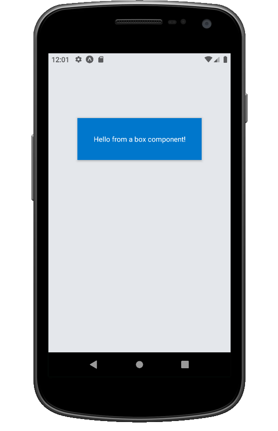
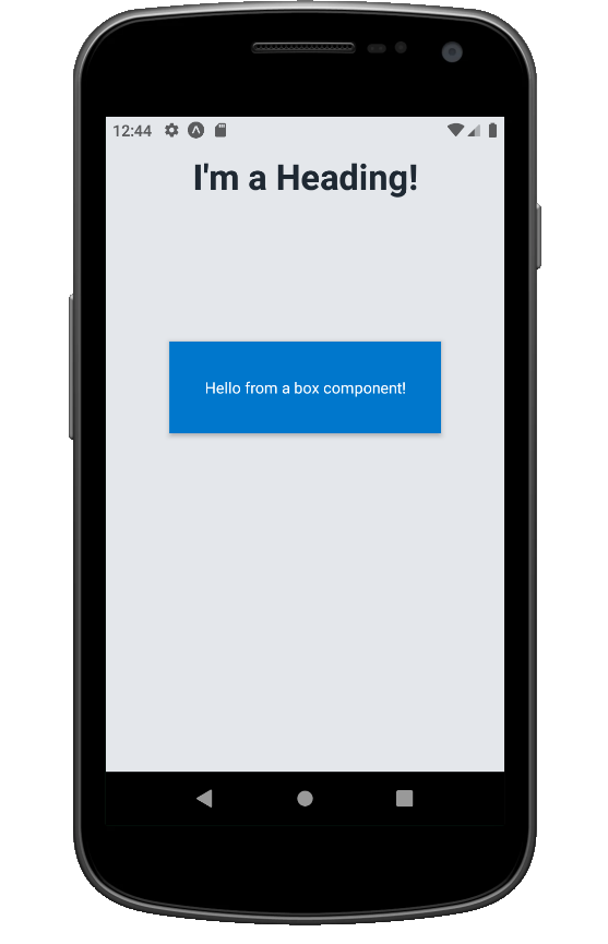
<box flex="{1}" alignitems="center" backgroundcolor="background"></box>
<headingmt="{4}">I'm a Heading!</heading><boxmargintop="{6}"padding="{4}"backgroundcolor="primary"shadow="md"></box><textstyle="{{"color:="" "white"="" }}="">Hello from a box component!</text>
Going back to our app, we can see it in action:
Conclusion
These two components will give us a solid foundation to build on our theme and implement a design system throughout our application. From here, we could reuse them to implement layout primitives such as a Stack, Inline, or Grid, and typography components such as SubHeading, Content or TextLink. The theme object can also be extended with your brand colors, new shadows and much more. Hopefully you can use this foundation to create awesome components in your React Native app!
Using techniques like what is listed above, we have had the opportunity to address clients’ concerns and they love it! If you are interested in joining our team, please visit our Careers page.
The Box component is a reusable building block designed to enforce consistent theme usage across a React Native application. It works like a flexible container that maps style props — such as spacing, colors, and shadows — to values defined in your global theme.
How does the Box component integrate with a theme?
The Box component uses Styled System to connect directly to a central theme object. This theme defines values like spacing, colors, font sizes, and shadows. By referencing these predefined values instead of hardcoding styles, developers maintain design consistency and make it easier to update styles across the entire app.
Why is using a theme important for React Native apps?
A theme ensures consistent visual design by standardizing colors, typography, spacing, and shadows across all components. Instead of guessing which size or color to use, developers rely on predefined values from the theme, which improves efficiency and creates a polished, unified interface.
Can the Box component handle custom styles?
Yes. While the Box component connects directly to the theme, developers can still pass custom styles through props. For example, you can set margin, padding, background color, or shadows using the theme keys, but you can also combine them with inline styles when needed for specific adjustments.
How can the Box component be extended for other UI elements?
The Box component provides a strong foundation for building a design system. You can use it to create additional layout primitives like Stack, Grid, or Inline components. It also integrates seamlessly with typography components, such as Heading or Content, making it easy to maintain a cohesive and reusable UI structure.
AI is changing software development.
The Engineer's AI-Enabled Development Handbook is your guide to incorporating AI into development processes for smoother, faster, and smarter development.
Enjoyed the article? Get new content delivered to your inbox.
Subscribe below and stay updated with the latest developer guides and industry insights.
Thank you! Your submission has been received!
Oops! Something went wrong while submitting the form.
We use cookies to provide our services, to allow us to better understand our audience, and to provide and serve personalized ads or content. By using our website, you consent to the terms of our Privacy Policy and our Cookie Policy, and the use of cookies, pixels, and other technology as described more fully therein
.svg)