Although there are a plethora of plugins that make prototyping apps a breeze, sometimes you need more customization, less bloat, or more reliable third-party libraries. Luckily, complex UI elements can be created using simple SVG elements, which can stretch and scale to fit any size and resolution.
Today we’ll be creating a simple gauge component in React without any plugins, using only SVG.
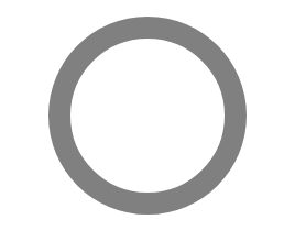
Draw a perfect circle
We’ll start by constructing a simple functional component that takes a single prop, radius, and returns an <svg/> element with a nested <circle></circle>.
Several attributes have been set to act as a base for our gauge. The viewport of the SVG can be set simply by doubling the radius that we pass as a prop.
The circle is centered by setting the cx and cy attributes to that same prop.
height={radius * 2}
width={radius * 2}
Next, we want to render a stroke around the circumference of the circle. However, if we set the radius r attribute of the circle to the same value we pass in, the circle will overflow the bounds of the SVG, so we need to do some math. We’ll need to determine the width of the stroke and the width of the inner radius of the gauge. Let’s set the stroke width to something simple.
const strokeWidth = radius * 0.2;
Since the circle will render the width of its stroke, centered, along its circumference, all we need to do is subtract half of the stroke width from the radius we passed as a prop.
const innerRadius = radius - ( strokeWidth / 2 );
This will give us a circle that we can use to create our gauge.
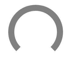
Now that we’ve established the base elements of our SVG, we need to start shaping them into a gauge. First, we’ll need to calculate and define the circumference of our circle. For this example, we’ll set the angle of our arc to 270°.
Next, limit the stroke of our circle to that arc. We can accomplish this by using the strokeDasharray attribute, which determines the length of dashes and gaps when rendering the stroke of our circle element. By passing the length of our arc and the circumference of the circle, we can trick the strokeDasharray attribute to add a stroke in the form of an arc followed by a gap. This gap will always fill the remainder of the circle.
Since the SVG will begin its stroke at 0°, which is normally on the right end of the circle, we’ll also need to use a transformation to rotate the circle so the arc is facing upward. This will differ based on the angle of your arc and the direction it should face.
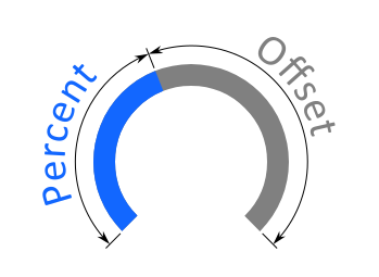
It’s starting to look like a gauge, but we’re not done yet! We can use this shape as the base and set up the filled gauge percent with a prop. To render the percent on top of the base, we’ll simply make a copy of the <circle></circle> element we’ve created and make some slight adjustments. First, we’ll need to pass a percent prop to our component and give the stroke a different color to distinguish against the gray background.
Next, we’ll be using the strokeDashoffset attribute to show the progress of our gauge, which changes where the stroke of our circle will begin. If we pass the full length of our arc, it will show no progress. If we pass 0, it will fill the gauge. Knowing this, we can easily find the offset we need by subtracting the percent of the arc that represents progress along our gauge from the length of the arc. We’ll also go ahead and normalize our percent so that values outside of the range 0 - 100 don’t break our component.
And just like that, we have a simple gauge component without using any plugins.
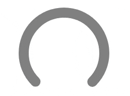
For some flair, we’ll round the ends of our gauge using strokeLinecap and add a simple gradient. Unfortunately, there is no standard support for conical gradients, so we’ll be using a simple linear gradient. We can even animate any changes to the percent prop by adding a transition to the dash array attribute.
An SVG gauge component is a visual element used to represent progress, performance, or any measurable value in a circular or semi-circular format. In this tutorial, the gauge is built using SVG elements, making it scalable, lightweight, and highly customizable without relying on external plugins.
Why build a custom gauge instead of using a plugin?
Using a custom-built gauge provides more control over design, performance, and flexibility. Unlike third-party plugins, a custom SVG gauge has less overhead, fewer dependencies, and can be easily adapted to specific project requirements while keeping the codebase lean and maintainable.
How does the gauge display progress?
The gauge visually represents progress by controlling the visible portion of the stroke around the circle. It calculates the circumference, determines the length of the arc, and adjusts the strokeDashoffset based on the percentage value provided. A higher percentage means more of the stroke is visible, creating the effect of a filling gauge.
Can I customize the gauge’s appearance?
Yes. The gauge supports customization for stroke colors, gradients, stroke widths, and sizes. In the example from the tutorial, a linear gradient and rounded stroke caps are added for a more polished appearance. Developers can also change the radius, arc angle, and colors to match their project’s design.
Is the gauge component reusable across projects?
Absolutely. The component is designed to be reusable and easily integrated into different React projects. By passing props like percent and radius, you can control the appearance and behavior of the gauge without rewriting any logic, making it a lightweight, adaptable solution for displaying progress.
AI is changing software development.
The Engineer's AI-Enabled Development Handbook is your guide to incorporating AI into development processes for smoother, faster, and smarter development.
Enjoyed the article? Get new content delivered to your inbox.
Subscribe below and stay updated with the latest developer guides and industry insights.
Thank you! Your submission has been received!
Oops! Something went wrong while submitting the form.
We use cookies to provide our services, to allow us to better understand our audience, and to provide and serve personalized ads or content. By using our website, you consent to the terms of our Privacy Policy and our Cookie Policy, and the use of cookies, pixels, and other technology as described more fully therein
The GPC signal has been honored.
Thank you! Your submission has been received!
Oops! Something went wrong while submitting the form.
.svg)